import { Component, Event, EventEmitter, h, Prop } from '@stencil/core';
import { withComponentRegistry } from '../../../core/player/withComponentRegistry';
/**
* Menu radio buttons are presented in radio groups (a collection of radio buttons describing a set
* of related options). Only one radio button in a group can be selected at the same time.
*
* ## Visual
*
* 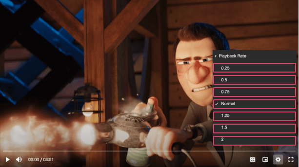 */
@Component({
tag: 'vm-menu-radio',
shadow: true,
})
export class MenuRadio {
/**
* The title of the radio item displayed to the user.
*/
@Prop() label!: string;
/**
* The value associated with this radio item.
*/
@Prop() value!: string;
/**
* Whether the radio item is selected or not.
*/
@Prop({ mutable: true }) checked = false;
/**
* This can provide additional context about the value. For example, if the option is for a set of
* video qualities, the badge could describe whether the quality is UHD, HD etc.
*/
@Prop() badge?: string;
/**
* The URL to an SVG element or fragment to load.
*/
@Prop() checkIcon?: string = 'check';
/**
* The name of an icon library to use. Defaults to the library defined by the `icons` player
* property.
*/
@Prop() icons?: string;
/**
* Emitted when the radio button is selected.
*/
@Event() vmCheck!: EventEmitter;
constructor() {
withComponentRegistry(this);
}
private onClick() {
this.checked = true;
this.vmCheck.emit();
}
render() {
return (
);
}
}
*/
@Component({
tag: 'vm-menu-radio',
shadow: true,
})
export class MenuRadio {
/**
* The title of the radio item displayed to the user.
*/
@Prop() label!: string;
/**
* The value associated with this radio item.
*/
@Prop() value!: string;
/**
* Whether the radio item is selected or not.
*/
@Prop({ mutable: true }) checked = false;
/**
* This can provide additional context about the value. For example, if the option is for a set of
* video qualities, the badge could describe whether the quality is UHD, HD etc.
*/
@Prop() badge?: string;
/**
* The URL to an SVG element or fragment to load.
*/
@Prop() checkIcon?: string = 'check';
/**
* The name of an icon library to use. Defaults to the library defined by the `icons` player
* property.
*/
@Prop() icons?: string;
/**
* Emitted when the radio button is selected.
*/
@Event() vmCheck!: EventEmitter;
constructor() {
withComponentRegistry(this);
}
private onClick() {
this.checked = true;
this.vmCheck.emit();
}
render() {
return (
);
}
}