;
constructor() {
withComponentRegistry(this);
withPlayerContext(this, ['isTouch']);
}
/**
* Focuses the menu item.
*/
@Method()
async focusItem() {
this.menuItem?.focus();
}
/**
* Removes focus from the menu item.
*/
@Method()
async blurItem() {
this.menuItem?.blur();
}
/**
* Returns the height of the menu item.
*/
@Method()
async getHeight() {
return parseFloat(
this.menuItem ? window.getComputedStyle(this.menuItem).height : '0',
);
}
private onClick() {
if (!isNil(this.menu)) this.menu.active = !this.expanded;
}
private onFocus() {
this.vmFocus.emit();
}
private onBlur() {
this.vmBlur.emit();
}
private onTouchStart() {
this.showTapHighlight = true;
}
private onTouchEnd() {
setTimeout(() => {
this.showTapHighlight = false;
}, 100);
}
private onMouseLeave() {
this.menuItem?.blur();
}
render() {
const isCheckedDefined = !isUndefined(this.checked);
const isMenuDefined = !isUndefined(this.menu);
const hasExpanded = this.expanded ? 'true' : 'false';
const isChecked = this.checked ? 'true' : 'false';
const showCheckedIcon = isCheckedDefined && !isUndefined(this.checkIcon);
const showLeftNavArrow = isMenuDefined && this.expanded;
const showRightNavArrow = isMenuDefined && !this.expanded;
const showHint =
!isUndefined(this.hint) &&
!isCheckedDefined &&
(!isMenuDefined || !this.expanded);
const showBadge =
!isUndefined(this.badge) && !showHint && !showRightNavArrow;
const hasSpacer = showHint || showRightNavArrow;
return (
{
this.menuItem = el;
}}
>
{showCheckedIcon && (
)}
{showLeftNavArrow && }
{this.label}
{hasSpacer && }
{showHint && {this.hint}}
{showBadge && {this.badge}}
{showRightNavArrow && }
);
}
}
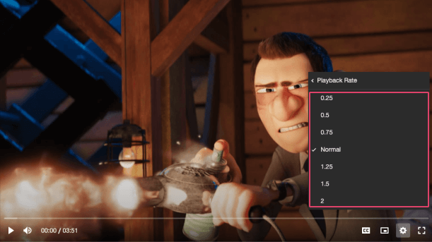 */
@Component({
tag: 'vm-menu-item',
styleUrl: 'menu-item.css',
shadow: true,
})
export class MenuItem {
private menuItem?: HTMLDivElement;
@Element() host!: HTMLVmMenuItemElement;
@State() showTapHighlight = false;
/**
* The `id` attribute of the item.
*/
@Prop() identifier?: string;
/**
* Whether the item is displayed or not.
*/
@Prop() hidden = false;
/**
* The label/title of the item.
*/
@Prop() label!: string;
/**
* If the item has a popup menu, then this should be a reference to it.
*/
@Prop() menu?: HTMLVmMenuElement;
/**
* If the item has a popup menu, this indicates whether the menu is open or not. Sets the
* `aria-expanded` property.
*/
@Prop() expanded?: boolean;
/**
* If this item is to behave as a radio button, then this property determines whether the
* radio is selected or not. Sets the `aria-checked` property.
*/
@Prop() checked?: boolean;
/**
* This can provide additional context about some underlying state of the item. For example, if
* the menu item opens/closes a submenu with options, the hint could be the currently selected
* option. If `checked` is defined, `hint` is not shown.
*/
@Prop() hint?: string;
/**
* This can provide additional context about the value of a menu item. For example, if the item
* is a radio button for a set of video qualities, the badge could describe whether the quality
* is UHD, HD etc. If `hint` is shown, `badge` is not shown.
*/
@Prop() badge?: string;
/**
* The name of the checkmark icon to resolve from the icon library.
*/
@Prop() checkIcon?: string = 'check';
/**
* The name of an icon library to use. Defaults to the library defined by the `icons` player
* property.
*/
@Prop() icons?: string;
/** @internal */
@Prop() isTouch: PlayerProps['isTouch'] = false;
/**
* Emitted when the item is focused.
*/
@Event() vmFocus!: EventEmitter
*/
@Component({
tag: 'vm-menu-item',
styleUrl: 'menu-item.css',
shadow: true,
})
export class MenuItem {
private menuItem?: HTMLDivElement;
@Element() host!: HTMLVmMenuItemElement;
@State() showTapHighlight = false;
/**
* The `id` attribute of the item.
*/
@Prop() identifier?: string;
/**
* Whether the item is displayed or not.
*/
@Prop() hidden = false;
/**
* The label/title of the item.
*/
@Prop() label!: string;
/**
* If the item has a popup menu, then this should be a reference to it.
*/
@Prop() menu?: HTMLVmMenuElement;
/**
* If the item has a popup menu, this indicates whether the menu is open or not. Sets the
* `aria-expanded` property.
*/
@Prop() expanded?: boolean;
/**
* If this item is to behave as a radio button, then this property determines whether the
* radio is selected or not. Sets the `aria-checked` property.
*/
@Prop() checked?: boolean;
/**
* This can provide additional context about some underlying state of the item. For example, if
* the menu item opens/closes a submenu with options, the hint could be the currently selected
* option. If `checked` is defined, `hint` is not shown.
*/
@Prop() hint?: string;
/**
* This can provide additional context about the value of a menu item. For example, if the item
* is a radio button for a set of video qualities, the badge could describe whether the quality
* is UHD, HD etc. If `hint` is shown, `badge` is not shown.
*/
@Prop() badge?: string;
/**
* The name of the checkmark icon to resolve from the icon library.
*/
@Prop() checkIcon?: string = 'check';
/**
* The name of an icon library to use. Defaults to the library defined by the `icons` player
* property.
*/
@Prop() icons?: string;
/** @internal */
@Prop() isTouch: PlayerProps['isTouch'] = false;
/**
* Emitted when the item is focused.
*/
@Event() vmFocus!: EventEmitter