import { Component, h, Prop, State, Watch } from '@stencil/core';
import { Disposal } from '../../../../utils/Disposal';
import { listen } from '../../../../utils/dom';
import { isUndefined } from '../../../../utils/unit';
import { findPlayer } from '../../../core/player/findPlayer';
import {
createDispatcher,
Dispatcher,
} from '../../../core/player/PlayerDispatcher';
import { PlayerProps } from '../../../core/player/PlayerProps';
import { withComponentRegistry } from '../../../core/player/withComponentRegistry';
import { withPlayerContext } from '../../../core/player/withPlayerContext';
import { TooltipDirection, TooltipPosition } from '../../tooltip/types';
/**
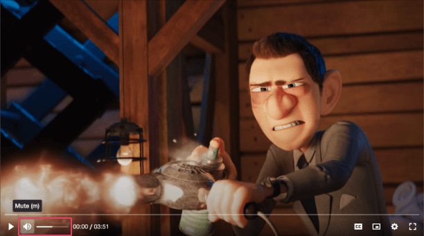
* A control for adjusting the volume of the player and toggling the muted state.
*
* ## Visual
*
*  */
@Component({
tag: 'vm-volume-control',
styleUrl: 'volume-control.css',
shadow: true,
})
export class VolumeControl {
private dispatch!: Dispatcher;
private keyboardDisposal = new Disposal();
private prevMuted = false;
private hideSliderTimeout?: number;
@State() currentVolume = 50;
@State() isSliderActive = false;
/**
* The name of the low volume icon to resolve from the icon library.
*/
@Prop() lowVolumeIcon = 'volume-low';
/**
* The name of the high volume icon to resolve from the icon library.
*/
@Prop() highVolumeIcon = 'volume-high';
/**
* The name of the muted volume icon to resolve from the icon library.
*/
@Prop() mutedIcon = 'volume-mute';
/**
* The name of an icon library to use. Defaults to the library defined by the `icons` player
* property.
*/
@Prop() icons?: string;
/**
* Whether the tooltip is positioned above/below the control.
*/
@Prop() tooltipPosition: TooltipPosition = 'top';
/**
* The direction in which the tooltip should grow.
*/
@Prop() tooltipDirection: TooltipDirection;
/**
* Whether the tooltip should be hidden.
*/
@Prop() hideTooltip = false;
/**
* A pipe (`/`) separated string of JS keyboard keys, that when caught in a `keydown` event, will
* toggle the muted state of the player.
*/
@Prop() muteKeys?: string = 'm';
/**
* Prevents the volume being changed using the Up/Down arrow keys.
*/
@Prop() noKeyboard = false;
@Watch('noKeyboard')
async onNoKeyboardChange() {
this.keyboardDisposal.empty();
if (this.noKeyboard) return;
const player = await findPlayer(this);
if (isUndefined(player)) return;
this.keyboardDisposal.add(
listen(player, 'keydown', (event: KeyboardEvent) => {
if (event.key !== 'ArrowUp' && event.key !== 'ArrowDown') return;
const isUpArrow = event.key === 'ArrowUp';
const newVolume = isUpArrow
? Math.min(100, this.volume + 5)
: Math.max(0, this.volume - 5);
this.dispatch('volume', parseInt(`${newVolume}`, 10));
}),
);
}
/** @internal */
@Prop() muted: PlayerProps['muted'] = false;
/** @internal */
@Prop() volume: PlayerProps['volume'] = 50;
@Watch('muted')
@Watch('volume')
onPlayerVolumeChange() {
this.currentVolume = this.muted ? 0 : this.volume;
if (!this.muted && this.prevMuted && this.volume === 0) {
this.dispatch('volume', 30);
}
this.prevMuted = this.muted;
}
/** @internal */
@Prop() isMobile: PlayerProps['isMobile'] = false;
/** @internal */
@Prop() i18n: PlayerProps['i18n'] = {};
constructor() {
withComponentRegistry(this);
withPlayerContext(this, ['volume', 'muted', 'isMobile', 'i18n']);
}
connectedCallback() {
this.prevMuted = this.muted;
this.dispatch = createDispatcher(this);
this.onNoKeyboardChange();
}
disconnectedCallback() {
this.keyboardDisposal.empty();
}
private onShowSlider() {
clearTimeout(this.hideSliderTimeout);
this.isSliderActive = true;
}
private onHideSlider() {
this.hideSliderTimeout = setTimeout(() => {
this.isSliderActive = false;
}, 100) as any;
}
private onVolumeChange(event: CustomEvent) {
const newVolume = event.detail;
this.currentVolume = newVolume;
this.dispatch('volume', newVolume);
this.dispatch('muted', newVolume === 0);
}
private onKeyDown(event: KeyboardEvent) {
if (event.key !== 'ArrowLeft' && event.key !== 'ArrowRight') return;
event.stopPropagation();
}
render() {
return (
*/
@Component({
tag: 'vm-volume-control',
styleUrl: 'volume-control.css',
shadow: true,
})
export class VolumeControl {
private dispatch!: Dispatcher;
private keyboardDisposal = new Disposal();
private prevMuted = false;
private hideSliderTimeout?: number;
@State() currentVolume = 50;
@State() isSliderActive = false;
/**
* The name of the low volume icon to resolve from the icon library.
*/
@Prop() lowVolumeIcon = 'volume-low';
/**
* The name of the high volume icon to resolve from the icon library.
*/
@Prop() highVolumeIcon = 'volume-high';
/**
* The name of the muted volume icon to resolve from the icon library.
*/
@Prop() mutedIcon = 'volume-mute';
/**
* The name of an icon library to use. Defaults to the library defined by the `icons` player
* property.
*/
@Prop() icons?: string;
/**
* Whether the tooltip is positioned above/below the control.
*/
@Prop() tooltipPosition: TooltipPosition = 'top';
/**
* The direction in which the tooltip should grow.
*/
@Prop() tooltipDirection: TooltipDirection;
/**
* Whether the tooltip should be hidden.
*/
@Prop() hideTooltip = false;
/**
* A pipe (`/`) separated string of JS keyboard keys, that when caught in a `keydown` event, will
* toggle the muted state of the player.
*/
@Prop() muteKeys?: string = 'm';
/**
* Prevents the volume being changed using the Up/Down arrow keys.
*/
@Prop() noKeyboard = false;
@Watch('noKeyboard')
async onNoKeyboardChange() {
this.keyboardDisposal.empty();
if (this.noKeyboard) return;
const player = await findPlayer(this);
if (isUndefined(player)) return;
this.keyboardDisposal.add(
listen(player, 'keydown', (event: KeyboardEvent) => {
if (event.key !== 'ArrowUp' && event.key !== 'ArrowDown') return;
const isUpArrow = event.key === 'ArrowUp';
const newVolume = isUpArrow
? Math.min(100, this.volume + 5)
: Math.max(0, this.volume - 5);
this.dispatch('volume', parseInt(`${newVolume}`, 10));
}),
);
}
/** @internal */
@Prop() muted: PlayerProps['muted'] = false;
/** @internal */
@Prop() volume: PlayerProps['volume'] = 50;
@Watch('muted')
@Watch('volume')
onPlayerVolumeChange() {
this.currentVolume = this.muted ? 0 : this.volume;
if (!this.muted && this.prevMuted && this.volume === 0) {
this.dispatch('volume', 30);
}
this.prevMuted = this.muted;
}
/** @internal */
@Prop() isMobile: PlayerProps['isMobile'] = false;
/** @internal */
@Prop() i18n: PlayerProps['i18n'] = {};
constructor() {
withComponentRegistry(this);
withPlayerContext(this, ['volume', 'muted', 'isMobile', 'i18n']);
}
connectedCallback() {
this.prevMuted = this.muted;
this.dispatch = createDispatcher(this);
this.onNoKeyboardChange();
}
disconnectedCallback() {
this.keyboardDisposal.empty();
}
private onShowSlider() {
clearTimeout(this.hideSliderTimeout);
this.isSliderActive = true;
}
private onHideSlider() {
this.hideSliderTimeout = setTimeout(() => {
this.isSliderActive = false;
}, 100) as any;
}
private onVolumeChange(event: CustomEvent) {
const newVolume = event.detail;
this.currentVolume = newVolume;
this.dispatch('volume', newVolume);
this.dispatch('muted', newVolume === 0);
}
private onKeyDown(event: KeyboardEvent) {
if (event.key !== 'ArrowLeft' && event.key !== 'ArrowRight') return;
event.stopPropagation();
}
render() {
return (
);
}
}