---
title: vime-tooltip
sidebar_label: Tooltip
---
import Tabs from '@theme/Tabs'
import TabItem from '@theme/TabItem'
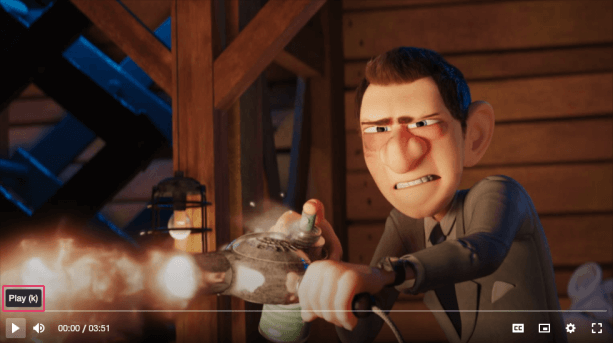
A small pop-up box that appears when a user moves their mouse over an element. Their main purpose
is to provide a description about the function of that element.
## Visual
 ## Usage
```html {7}
Title
```
```tsx {7,18}
import React from 'react';
import {
VimePlayer,
VimeUi,
VimeControls,
VimeControl,
VimeTooltip,
} from '@vime/react';
function Example() {
return (
{/* ... */}
{/* ... */}
Title
);
}
```
```html {8,21,30} title="example.vue"
Title
```
```html {7,19} title="example.svelte"
Title
```
```tsx {10}
class Example {
render() {
return (
{/* ... */}
{/* ... */}
Title
);
}
}
```
```html {7} title="example.html"
Title
```
## Properties
| Property | Attribute | Description | Type | Default |
| ----------- | ----------- | ------------------------------------------------------------------------------------------------------------------------------------- | ------------------------------ | ----------- |
| `active` | `active` | Whether the tooltip is visible or not. | `boolean` | `false` |
| `direction` | `direction` | Determines if the tooltip should grow according to its contents to the left/right. By default content grows outwards from the center. | `"left" ∣ "right" ∣ undefined` | `undefined` |
| `hidden` | `hidden` | Whether the tooltip is displayed or not. | `boolean` | `false` |
| `position` | `position` | Determines if the tooltip appears on top/bottom of it's parent. | `"bottom" ∣ "top"` | `'top'` |
## Slots
| Slot | Description |
| ---- | -------------------------------------------- |
| | Used to pass in the contents of the tooltip. |
## CSS Custom Properties
| Name | Description |
| ------------------------------- | ---------------------------------------------------------------- |
| `--vm-tooltip-bg` | The background color of the tooltip. |
| `--vm-tooltip-border-radius` | The border radius of the tooltip. |
| `--vm-tooltip-box-shadow` | The box shadow cast around the tooltip. |
| `--vm-tooltip-color` | The text color of the tooltip. |
| `--vm-tooltip-fade-duration` | The length in seconds that the tooltip will take to fade in/out. |
| `--vm-tooltip-fade-timing-func` | The transition timing function for fading in and out. |
| `--vm-tooltip-font-size` | The font size of the tooltip text. |
| `--vm-tooltip-padding` | The padding inside the tooltip. |
| `--vm-tooltip-spacing` | The space between the tooltip and its parent when active. |
| `--vm-tooltip-z-index` | The position in the UI z-axis stack inside the player. |
## Dependencies
### Used by
- [vime-caption-control](controls/caption-control.md)
- [vime-fullscreen-control](controls/fullscreen-control.md)
- [vime-mute-control](controls/mute-control.md)
- [vime-pip-control](controls/pip-control.md)
- [vime-playback-control](controls/playback-control.md)
- [vime-scrubber-control](controls/scrubber-control.md)
- [vime-settings-control](controls/settings-control.md)
### Graph
```mermaid
graph TD;
vime-caption-control --> vime-tooltip
vime-fullscreen-control --> vime-tooltip
vime-mute-control --> vime-tooltip
vime-pip-control --> vime-tooltip
vime-playback-control --> vime-tooltip
vime-scrubber-control --> vime-tooltip
vime-settings-control --> vime-tooltip
style vime-tooltip fill:#f9f,stroke:#333,stroke-width:4px
```
---
_Built with [StencilJS](https://stenciljs.com/)_
## Usage
```html {7}
Title
```
```tsx {7,18}
import React from 'react';
import {
VimePlayer,
VimeUi,
VimeControls,
VimeControl,
VimeTooltip,
} from '@vime/react';
function Example() {
return (
{/* ... */}
{/* ... */}
Title
);
}
```
```html {8,21,30} title="example.vue"
Title
```
```html {7,19} title="example.svelte"
Title
```
```tsx {10}
class Example {
render() {
return (
{/* ... */}
{/* ... */}
Title
);
}
}
```
```html {7} title="example.html"
Title
```
## Properties
| Property | Attribute | Description | Type | Default |
| ----------- | ----------- | ------------------------------------------------------------------------------------------------------------------------------------- | ------------------------------ | ----------- |
| `active` | `active` | Whether the tooltip is visible or not. | `boolean` | `false` |
| `direction` | `direction` | Determines if the tooltip should grow according to its contents to the left/right. By default content grows outwards from the center. | `"left" ∣ "right" ∣ undefined` | `undefined` |
| `hidden` | `hidden` | Whether the tooltip is displayed or not. | `boolean` | `false` |
| `position` | `position` | Determines if the tooltip appears on top/bottom of it's parent. | `"bottom" ∣ "top"` | `'top'` |
## Slots
| Slot | Description |
| ---- | -------------------------------------------- |
| | Used to pass in the contents of the tooltip. |
## CSS Custom Properties
| Name | Description |
| ------------------------------- | ---------------------------------------------------------------- |
| `--vm-tooltip-bg` | The background color of the tooltip. |
| `--vm-tooltip-border-radius` | The border radius of the tooltip. |
| `--vm-tooltip-box-shadow` | The box shadow cast around the tooltip. |
| `--vm-tooltip-color` | The text color of the tooltip. |
| `--vm-tooltip-fade-duration` | The length in seconds that the tooltip will take to fade in/out. |
| `--vm-tooltip-fade-timing-func` | The transition timing function for fading in and out. |
| `--vm-tooltip-font-size` | The font size of the tooltip text. |
| `--vm-tooltip-padding` | The padding inside the tooltip. |
| `--vm-tooltip-spacing` | The space between the tooltip and its parent when active. |
| `--vm-tooltip-z-index` | The position in the UI z-axis stack inside the player. |
## Dependencies
### Used by
- [vime-caption-control](controls/caption-control.md)
- [vime-fullscreen-control](controls/fullscreen-control.md)
- [vime-mute-control](controls/mute-control.md)
- [vime-pip-control](controls/pip-control.md)
- [vime-playback-control](controls/playback-control.md)
- [vime-scrubber-control](controls/scrubber-control.md)
- [vime-settings-control](controls/settings-control.md)
### Graph
```mermaid
graph TD;
vime-caption-control --> vime-tooltip
vime-fullscreen-control --> vime-tooltip
vime-mute-control --> vime-tooltip
vime-pip-control --> vime-tooltip
vime-playback-control --> vime-tooltip
vime-scrubber-control --> vime-tooltip
vime-settings-control --> vime-tooltip
style vime-tooltip fill:#f9f,stroke:#333,stroke-width:4px
```
---
_Built with [StencilJS](https://stenciljs.com/)_