---
title: vime-menu-item
sidebar_label: MenuItem
---
import Tabs from '@theme/Tabs'
import TabItem from '@theme/TabItem'
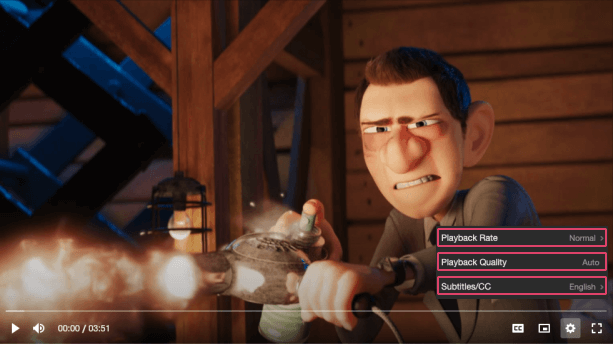
A multi-purpose interactable element inside a menu. The behaviour and style of the item depends on
the props set.
- **Default:** By default, the menu item only contains a label and optional hint/badge text that is
displayed on the right-hand side of the item.
- **Navigation:** If the `menu` prop is set, the item behaves as a navigational control and displays
arrows to indicate whether clicking the control will navigate forwards/backwards.
- **Radio:** If the `checked` prop is set, the item behaves as a radio button and displays a
checkmark icon to indicate whether it is checked or not.
## Visual
 ## Usage
```html {6}
```
```tsx {2,11}
import React from 'react';
import { VimePlayer, VimeUi, VimeSettings, VimeMenuItem } from '@vime/react';
function Example() {
return (
{/* ... */}
{/* ... */}
);
}
```
```html {7,14,21} title="example.vue"
```
```html {6,16} title="example.svelte"
```
```tsx {9}
class Example {
render() {
return (
{/* ... */}
{/* ... */}
);
}
}
```
```html {6} title="example.html"
```
## Properties
| Property | Attribute | Description | Type | Default |
| -------------------- | -------------- | --------------------------------------------------------------------------------------------------------------------------------------------------------------------------------------------------------- | --------------------- | ------------------- |
| `badge` | `badge` | This can provide additional context about the value of a menu item. For example, if the item is a radio button for a set of video qualities, the badge could describe whether the quality is UHD, HD etc. | `string ∣ undefined` | `undefined` |
| `checked` | `checked` | If this item is to behave as a radio button, then this property determines whether the radio is selected or not. Sets the `aria-checked` property. | `boolean ∣ undefined` | `undefined` |
| `checkedIcon` | `checked-icon` | The URL to an SVG element or fragment to load. | `string ∣ undefined` | `'#vime-checkmark'` |
| `expanded` | `expanded` | If the item has a popup menu, this indicates whether the menu is open or not. Sets the `aria-expanded` property. | `boolean ∣ undefined` | `undefined` |
| `hidden` | `hidden` | Whether the item is displayed or not. | `boolean` | `false` |
| `hint` | `hint` | This can provide additional context about some underlying state of the item. For example, if the menu item opens/closes a submenu with options, the hint could be the currently selected option. | `string ∣ undefined` | `undefined` |
| `identifier` | `identifier` | The `id` attribute of the item. | `string ∣ undefined` | `undefined` |
| `label` _(required)_ | `label` | The label/title of the item. | `string` | `undefined` |
| `menu` | `menu` | If the item has a popup menu, then this should be the `id` of said menu. Sets the `aria-controls` property. | `string ∣ undefined` | `undefined` |
## CSS Custom Properties
| Name | Description |
| ---------------------------------- | ---------------------------------------------------------------------------- |
| `--vm-menu-item-arrow-color` | The color of the left/right arrow on a navigational menu item. |
| `--vm-menu-item-badge-bg` | The background color of the badge. |
| `--vm-menu-item-badge-color` | The color of the badge text. |
| `--vm-menu-item-badge-font-size` | The font size of the the badge text. |
| `--vm-menu-item-check-icon-height` | The height of the checked icon. |
| `--vm-menu-item-check-icon-width` | The width of the checked icon. |
| `--vm-menu-item-divider-color` | The color of the divider between a navigational menu item and the menu body. |
| `--vm-menu-item-focus-bg` | The background color of a menu item when it is being focused or hovered on. |
| `--vm-menu-item-focus-color` | The color of a menu item's text when it is being focused or hovered on. |
| `--vm-menu-item-hint-color` | The color of the hint text. |
| `--vm-menu-item-hint-font-size` | The font size of the hint text. |
| `--vm-menu-item-hint-opacity` | The opacity of the hint text. |
| `--vm-menu-item-padding` | The padding within each menu item. |
| `--vm-menu-item-tap-highlight` | The highlight color when a menu item is tapped. |
## Dependencies
### Used by
- [vime-default-settings](default-settings.md)
- [vime-menu-radio](menu-radio.md)
- [vime-submenu](submenu.md)
### Depends on
- [vime-icon](../icon.md)
### Graph
```mermaid
graph TD;
vime-menu-item --> vime-icon
vime-default-settings --> vime-menu-item
vime-menu-radio --> vime-menu-item
vime-submenu --> vime-menu-item
style vime-menu-item fill:#f9f,stroke:#333,stroke-width:4px
```
---
_Built with [StencilJS](https://stenciljs.com/)_
## Usage
```html {6}
```
```tsx {2,11}
import React from 'react';
import { VimePlayer, VimeUi, VimeSettings, VimeMenuItem } from '@vime/react';
function Example() {
return (
{/* ... */}
{/* ... */}
);
}
```
```html {7,14,21} title="example.vue"
```
```html {6,16} title="example.svelte"
```
```tsx {9}
class Example {
render() {
return (
{/* ... */}
{/* ... */}
);
}
}
```
```html {6} title="example.html"
```
## Properties
| Property | Attribute | Description | Type | Default |
| -------------------- | -------------- | --------------------------------------------------------------------------------------------------------------------------------------------------------------------------------------------------------- | --------------------- | ------------------- |
| `badge` | `badge` | This can provide additional context about the value of a menu item. For example, if the item is a radio button for a set of video qualities, the badge could describe whether the quality is UHD, HD etc. | `string ∣ undefined` | `undefined` |
| `checked` | `checked` | If this item is to behave as a radio button, then this property determines whether the radio is selected or not. Sets the `aria-checked` property. | `boolean ∣ undefined` | `undefined` |
| `checkedIcon` | `checked-icon` | The URL to an SVG element or fragment to load. | `string ∣ undefined` | `'#vime-checkmark'` |
| `expanded` | `expanded` | If the item has a popup menu, this indicates whether the menu is open or not. Sets the `aria-expanded` property. | `boolean ∣ undefined` | `undefined` |
| `hidden` | `hidden` | Whether the item is displayed or not. | `boolean` | `false` |
| `hint` | `hint` | This can provide additional context about some underlying state of the item. For example, if the menu item opens/closes a submenu with options, the hint could be the currently selected option. | `string ∣ undefined` | `undefined` |
| `identifier` | `identifier` | The `id` attribute of the item. | `string ∣ undefined` | `undefined` |
| `label` _(required)_ | `label` | The label/title of the item. | `string` | `undefined` |
| `menu` | `menu` | If the item has a popup menu, then this should be the `id` of said menu. Sets the `aria-controls` property. | `string ∣ undefined` | `undefined` |
## CSS Custom Properties
| Name | Description |
| ---------------------------------- | ---------------------------------------------------------------------------- |
| `--vm-menu-item-arrow-color` | The color of the left/right arrow on a navigational menu item. |
| `--vm-menu-item-badge-bg` | The background color of the badge. |
| `--vm-menu-item-badge-color` | The color of the badge text. |
| `--vm-menu-item-badge-font-size` | The font size of the the badge text. |
| `--vm-menu-item-check-icon-height` | The height of the checked icon. |
| `--vm-menu-item-check-icon-width` | The width of the checked icon. |
| `--vm-menu-item-divider-color` | The color of the divider between a navigational menu item and the menu body. |
| `--vm-menu-item-focus-bg` | The background color of a menu item when it is being focused or hovered on. |
| `--vm-menu-item-focus-color` | The color of a menu item's text when it is being focused or hovered on. |
| `--vm-menu-item-hint-color` | The color of the hint text. |
| `--vm-menu-item-hint-font-size` | The font size of the hint text. |
| `--vm-menu-item-hint-opacity` | The opacity of the hint text. |
| `--vm-menu-item-padding` | The padding within each menu item. |
| `--vm-menu-item-tap-highlight` | The highlight color when a menu item is tapped. |
## Dependencies
### Used by
- [vime-default-settings](default-settings.md)
- [vime-menu-radio](menu-radio.md)
- [vime-submenu](submenu.md)
### Depends on
- [vime-icon](../icon.md)
### Graph
```mermaid
graph TD;
vime-menu-item --> vime-icon
vime-default-settings --> vime-menu-item
vime-menu-radio --> vime-menu-item
vime-submenu --> vime-menu-item
style vime-menu-item fill:#f9f,stroke:#333,stroke-width:4px
```
---
_Built with [StencilJS](https://stenciljs.com/)_