---
title: vime-fullscreen-control
sidebar_label: FullscreenControl
---
import Tabs from '@theme/Tabs'
import TabItem from '@theme/TabItem'
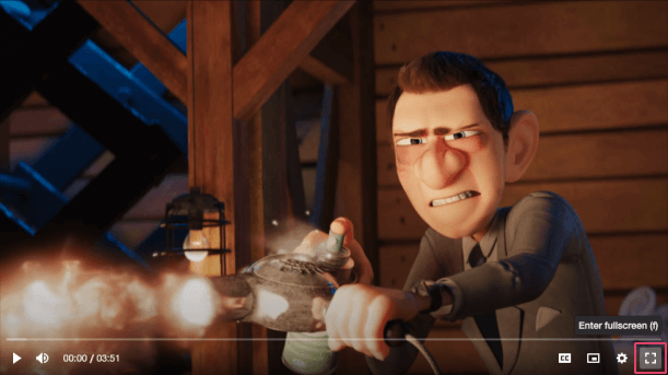
A control for toggling fullscreen mode. This control is not displayed if fullscreen cannot be
requested (checked via the `canSetFullscreen()` player method).
## Visual
 ## Usage
```html {7}
```
```tsx {6,16}
import React from 'react';
import {
VimePlayer,
VimeUi,
VimeControls,
VimeFullscreenControl,
} from '@vime/react';
function Example() {
return (
{/* ... */}
{/* ... */}
);
}
```
```html {7,18,26} title="example.vue"
```
```html {6,16} title="example.svelte"
```
```tsx {9}
class Example {
render() {
return (
{/* ... */}
{/* ... */}
);
}
}
```
```html {7} title="example.html"
```
## Properties
| Property | Attribute | Description | Type | Default |
| ------------------ | ------------------- | ------------------------------------------------------------------------------------------------------------------------------------------------------------- | ------------------------------ | -------------------------- |
| `enterIcon` | `enter-icon` | The URL to an SVG element or fragment to display for entering fullscreen. | `string` | `'#vime-enter-fullscreen'` |
| `exitIcon` | `exit-icon` | The URL to an SVG element or fragment to display for exiting fullscreen. | `string` | `'#vime-exit-fullscreen'` |
| `hideTooltip` | `hide-tooltip` | Whether the tooltip should not be displayed. | `boolean` | `false` |
| `keys` | `keys` | A slash (`/`) separated string of JS keyboard keys (`KeyboardEvent.key`), that when caught in a `keydown` event, will trigger a `click` event on the control. | `string ∣ undefined` | `'f'` |
| `tooltipDirection` | `tooltip-direction` | The direction in which the tooltip should grow. | `"left" ∣ "right" ∣ undefined` | `undefined` |
| `tooltipPosition` | `tooltip-position` | Whether the tooltip is positioned above/below the control. | `"bottom" ∣ "top"` | `'top'` |
## Dependencies
### Used by
- [vime-default-controls](default-controls.md)
### Depends on
- [vime-control](control.md)
- [vime-icon](../icon.md)
- [vime-tooltip](../tooltip.md)
### Graph
```mermaid
graph TD;
vime-fullscreen-control --> vime-control
vime-fullscreen-control --> vime-icon
vime-fullscreen-control --> vime-tooltip
vime-default-controls --> vime-fullscreen-control
style vime-fullscreen-control fill:#f9f,stroke:#333,stroke-width:4px
```
---
_Built with [StencilJS](https://stenciljs.com/)_
## Usage
```html {7}
```
```tsx {6,16}
import React from 'react';
import {
VimePlayer,
VimeUi,
VimeControls,
VimeFullscreenControl,
} from '@vime/react';
function Example() {
return (
{/* ... */}
{/* ... */}
);
}
```
```html {7,18,26} title="example.vue"
```
```html {6,16} title="example.svelte"
```
```tsx {9}
class Example {
render() {
return (
{/* ... */}
{/* ... */}
);
}
}
```
```html {7} title="example.html"
```
## Properties
| Property | Attribute | Description | Type | Default |
| ------------------ | ------------------- | ------------------------------------------------------------------------------------------------------------------------------------------------------------- | ------------------------------ | -------------------------- |
| `enterIcon` | `enter-icon` | The URL to an SVG element or fragment to display for entering fullscreen. | `string` | `'#vime-enter-fullscreen'` |
| `exitIcon` | `exit-icon` | The URL to an SVG element or fragment to display for exiting fullscreen. | `string` | `'#vime-exit-fullscreen'` |
| `hideTooltip` | `hide-tooltip` | Whether the tooltip should not be displayed. | `boolean` | `false` |
| `keys` | `keys` | A slash (`/`) separated string of JS keyboard keys (`KeyboardEvent.key`), that when caught in a `keydown` event, will trigger a `click` event on the control. | `string ∣ undefined` | `'f'` |
| `tooltipDirection` | `tooltip-direction` | The direction in which the tooltip should grow. | `"left" ∣ "right" ∣ undefined` | `undefined` |
| `tooltipPosition` | `tooltip-position` | Whether the tooltip is positioned above/below the control. | `"bottom" ∣ "top"` | `'top'` |
## Dependencies
### Used by
- [vime-default-controls](default-controls.md)
### Depends on
- [vime-control](control.md)
- [vime-icon](../icon.md)
- [vime-tooltip](../tooltip.md)
### Graph
```mermaid
graph TD;
vime-fullscreen-control --> vime-control
vime-fullscreen-control --> vime-icon
vime-fullscreen-control --> vime-tooltip
vime-default-controls --> vime-fullscreen-control
style vime-fullscreen-control fill:#f9f,stroke:#333,stroke-width:4px
```
---
_Built with [StencilJS](https://stenciljs.com/)_