---
title: vime-controls
sidebar_label: Controls
---
import Tabs from '@theme/Tabs'
import TabItem from '@theme/TabItem'
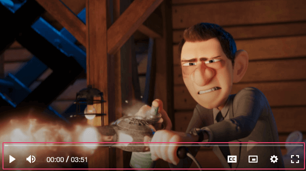
Responsible for positioning and laying out individual/groups of controls.
## Visual
 ## Usage
```html {5-7}
```
```tsx {2,10-12}
import React from 'react';
import { VimePlayer, VimeUi, VimeControls } from '@vime/react';
function Example() {
return (
{/* ... */}
{/* ... */}
{/* ... */}
);
}
```
```html {5-7,13,19} title="example.vue"
```
```tsx {5-7}
```
```html {2}
```
```tsx {8-10}
class Example {
render() {
return (
{/* ... */}
{/* ... */}
{/* ... */}
);
}
}
```
```html {5-7} title="example.html"
```
## Properties
| Property | Attribute | Description | Type | Default |
| ---------------------- | ------------------------- | --------------------------------------------------------------------------------------------------------------------------- | -------------------------------------------------------------------------------- | -------------- |
| `activeDuration` | `active-duration` | The length in milliseconds that the controls are active for before fading out. Audio players are not effected by this prop. | `number` | `2750` |
| `align` | `align` | Sets the `align-items` flex property that aligns the individual controls on the cross-axis. | `"center" ∣ "end" ∣ "start"` | `'center'` |
| `direction` | `direction` | Sets the `flex-direction` property that manages the direction in which the controls are layed out. | `"column" ∣ "row"` | `'row'` |
| `fullHeight` | `full-height` | Whether the controls container should be 100% height. This has no effect if the view is of type `audio`. | `boolean` | `false` |
| `fullWidth` | `full-width` | Whether the controls container should be 100% width. This has no effect if the view is of type `audio`. | `boolean` | `false` |
| `hidden` | `hidden` | Whether the controls are visible or not. | `boolean` | `false` |
| `hideOnMouseLeave` | `hide-on-mouse-leave` | Whether the controls should hide when the mouse leaves the player. Audio players are not effected by this prop. | `boolean` | `false` |
| `hideWhenPaused` | `hide-when-paused` | Whether the controls should show/hide when paused. Audio players are not effected by this prop. | `boolean` | `false` |
| `justify` | `justify` | Sets the `justify-content` flex property that aligns the individual controls on the main-axis. | `"center" ∣ "end" ∣ "space-around" ∣ "space-between" ∣ "space-evenly" ∣ "start"` | `'start'` |
| `pin` | `pin` | Pins the controls to the defined position inside the video player. This has no effect when the view is of type `audio`. | `"bottomLeft" ∣ "bottomRight" ∣ "center" ∣ "topLeft" ∣ "topRight"` | `'bottomLeft'` |
| `waitForPlaybackStart` | `wait-for-playback-start` | Whether the controls should wait for playback to start before being shown. Audio players are not effected by this prop. | `boolean` | `false` |
## Slots
| Slot | Description |
| ---- | ------------------------- |
| | Used to pass in controls. |
## CSS Custom Properties
| Name | Description |
| ----------------------- | ------------------------------------------------------ |
| `--vm-controls-bg` | The background color of the controls. |
| `--vm-controls-padding` | The padding inside the controls. |
| `--vm-controls-spacing` | The space between controls. |
| `--vm-controls-z-index` | The position in the UI z-axis stack inside the player. |
## Dependencies
### Used by
- [vime-default-controls](default-controls.md)
### Graph
```mermaid
graph TD;
vime-default-controls --> vime-controls
style vime-controls fill:#f9f,stroke:#333,stroke-width:4px
```
---
_Built with [StencilJS](https://stenciljs.com/)_
## Usage
```html {5-7}
```
```tsx {2,10-12}
import React from 'react';
import { VimePlayer, VimeUi, VimeControls } from '@vime/react';
function Example() {
return (
{/* ... */}
{/* ... */}
{/* ... */}
);
}
```
```html {5-7,13,19} title="example.vue"
```
```tsx {5-7}
```
```html {2}
```
```tsx {8-10}
class Example {
render() {
return (
{/* ... */}
{/* ... */}
{/* ... */}
);
}
}
```
```html {5-7} title="example.html"
```
## Properties
| Property | Attribute | Description | Type | Default |
| ---------------------- | ------------------------- | --------------------------------------------------------------------------------------------------------------------------- | -------------------------------------------------------------------------------- | -------------- |
| `activeDuration` | `active-duration` | The length in milliseconds that the controls are active for before fading out. Audio players are not effected by this prop. | `number` | `2750` |
| `align` | `align` | Sets the `align-items` flex property that aligns the individual controls on the cross-axis. | `"center" ∣ "end" ∣ "start"` | `'center'` |
| `direction` | `direction` | Sets the `flex-direction` property that manages the direction in which the controls are layed out. | `"column" ∣ "row"` | `'row'` |
| `fullHeight` | `full-height` | Whether the controls container should be 100% height. This has no effect if the view is of type `audio`. | `boolean` | `false` |
| `fullWidth` | `full-width` | Whether the controls container should be 100% width. This has no effect if the view is of type `audio`. | `boolean` | `false` |
| `hidden` | `hidden` | Whether the controls are visible or not. | `boolean` | `false` |
| `hideOnMouseLeave` | `hide-on-mouse-leave` | Whether the controls should hide when the mouse leaves the player. Audio players are not effected by this prop. | `boolean` | `false` |
| `hideWhenPaused` | `hide-when-paused` | Whether the controls should show/hide when paused. Audio players are not effected by this prop. | `boolean` | `false` |
| `justify` | `justify` | Sets the `justify-content` flex property that aligns the individual controls on the main-axis. | `"center" ∣ "end" ∣ "space-around" ∣ "space-between" ∣ "space-evenly" ∣ "start"` | `'start'` |
| `pin` | `pin` | Pins the controls to the defined position inside the video player. This has no effect when the view is of type `audio`. | `"bottomLeft" ∣ "bottomRight" ∣ "center" ∣ "topLeft" ∣ "topRight"` | `'bottomLeft'` |
| `waitForPlaybackStart` | `wait-for-playback-start` | Whether the controls should wait for playback to start before being shown. Audio players are not effected by this prop. | `boolean` | `false` |
## Slots
| Slot | Description |
| ---- | ------------------------- |
| | Used to pass in controls. |
## CSS Custom Properties
| Name | Description |
| ----------------------- | ------------------------------------------------------ |
| `--vm-controls-bg` | The background color of the controls. |
| `--vm-controls-padding` | The padding inside the controls. |
| `--vm-controls-spacing` | The space between controls. |
| `--vm-controls-z-index` | The position in the UI z-axis stack inside the player. |
## Dependencies
### Used by
- [vime-default-controls](default-controls.md)
### Graph
```mermaid
graph TD;
vime-default-controls --> vime-controls
style vime-controls fill:#f9f,stroke:#333,stroke-width:4px
```
---
_Built with [StencilJS](https://stenciljs.com/)_