---
title: vime-control
sidebar_label: Control
---
import Tabs from '@theme/Tabs'
import TabItem from '@theme/TabItem'
A generic player control that is designed to work with both touch and mouse devices. It also
seamlessly works with `vime-tooltip`, which can be passed in via the default `slot`.
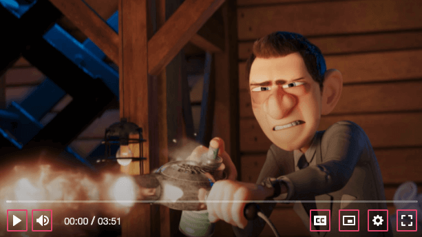
## Visual
 ## Usage
```html {6-9}
Play (k)
```
```tsx {3,24-33}
import React, { useMemo, useRef } from 'react';
import {
VimeControl,
VimeIcon,
VimeTooltip,
usePlayerContext,
} from '@vime/react';
function PlaybackControl() {
const ref = useRef(null);
const [paused, setPaused] = usePlayerContext(ref, 'paused', true);
const [i18n] = usePlayerContext(ref, 'i18n', {});
const icon = useMemo(() => (paused ? '#vime-play' : '#vime-pause'), [paused]);
const tooltip = useMemo(() => (paused ? i18n.play : i18n.pause), [
paused,
i18n,
]);
const onClick = () => {
setPaused(false);
};
return (
{tooltip} (k)
);
}
```
```html {2-10,16,24} title="playback-control.vue"
{{tooltip}} (k)
```
```html {2-10,19,27} title="playback-control.vue"
## Usage
```html {6-9}
Play (k)
```
```tsx {3,24-33}
import React, { useMemo, useRef } from 'react';
import {
VimeControl,
VimeIcon,
VimeTooltip,
usePlayerContext,
} from '@vime/react';
function PlaybackControl() {
const ref = useRef(null);
const [paused, setPaused] = usePlayerContext(ref, 'paused', true);
const [i18n] = usePlayerContext(ref, 'i18n', {});
const icon = useMemo(() => (paused ? '#vime-play' : '#vime-pause'), [paused]);
const tooltip = useMemo(() => (paused ? i18n.play : i18n.pause), [
paused,
i18n,
]);
const onClick = () => {
setPaused(false);
};
return (
{tooltip} (k)
);
}
```
```html {2-10,16,24} title="playback-control.vue"
{{tooltip}} (k)
```
```html {2-10,19,27} title="playback-control.vue"
{{tooltip}} (k)
```
```tsx
{tooltip} (k)
```
```html {4}
```
```tsx {35-45}
import { h, Component, Prop } from '@stencil/core';
import {
Dispatcher,
createDispatcher,
PlayerProps,
withPlayerContext,
} from '@vime/core';
@Component({
tag: 'playback-control',
})
export class PlaybackControl {
private dispatch!: Dispatcher;
/**
* @internal
*/
@Prop() paused: PlayerProps['paused'] = true;
/**
* @internal
*/
@Prop() i18n: PlayerProps['i18n'] = {};
connectedCallback() {
this.dispatch = createDispatcher(this);
}
private onClick() {
this.dispatch('paused', !this.paused);
}
render() {
return (
{this.paused ? this.i18n.play : this.i18n.pause} (k)
);
}
}
withPlayerContext(PlaybackControl, ['paused', 'i18n']);
```
```html title="playback-control.html"
{{tooltip}} (k)
```
```ts title="playback-control.ts"
import { Component, ElementRef } from '@angular/core';
import { VimeComponent } from '@vime/angular';
@Component({
selector: 'playback-control',
templateUrl: './playback-control.html',
})
class PlaybackControl extends VimeComponent {
paused = true;
i18n = {};
constructor(protected ref: ElementRef) {
super(['paused', 'i18n']);
}
get icon() {
return this.paused ? '#vime-play' : '#vime-pause';
}
get tooltip() {
return this.paused ? this.i18n.play : this.i18n.pause;
}
onClick() {
this.paused = !this.paused;
}
}
```
## Properties
| Property | Attribute | Description | Type | Default |
| -------------------- | ------------ | ------------------------------------------------------------------------------------------------------------------------------------------------------------- | --------------------- | ----------- |
| `expanded` | `expanded` | If the control has a popup menu, this indicates whether the menu is open or not. Sets the `aria-expanded` property. | `boolean ∣ undefined` | `undefined` |
| `hidden` | `hidden` | Whether the control should be displayed or not. | `boolean` | `false` |
| `identifier` | `identifier` | The `id` attribute of the control. | `string ∣ undefined` | `undefined` |
| `keys` | `keys` | A slash (`/`) separated string of JS keyboard keys (`KeyboardEvent.key`), that when caught in a `keydown` event, will trigger a `click` event on the control. | `string ∣ undefined` | `undefined` |
| `label` _(required)_ | `label` | The `aria-label` property of the control. | `string` | `undefined` |
| `menu` | `menu` | If the control has a popup menu, then this should be the `id` of said menu. Sets the `aria-controls` property. | `string ∣ undefined` | `undefined` |
| `pressed` | `pressed` | If the control is a toggle, this indicated whether the control is in a "pressed" state or not. Sets the `aria-pressed` property. | `boolean ∣ undefined` | `undefined` |
## Events
| Event | Description | Type |
| -------------------- | ---------------------------------------------------------------------------------------------- | ---------------------- |
| `vInteractionChange` | Emitted when the user is interacting with the control by focusing, touching or hovering on it. | `CustomEvent` |
## Slots
| Slot | Description |
| ---- | --------------------------------------------------------------- |
| | Used to pass in the content of the control (text/icon/tooltip). |
## CSS Custom Properties
| Name | Description |
| ---------------------------- | -------------------------------------------------------------------------- |
| `--vm-control-bg` | The background of the control. |
| `--vm-control-border` | The border of the control. |
| `--vm-control-border-radius` | The border radius of the control. |
| `--vm-control-color` | The text color of the control. |
| `--vm-control-focus-bg` | The background colour of a control when it is being hovered on or focused. |
| `--vm-control-focus-color` | The text colour of a control when it is being hovered on or focused. |
| `--vm-control-padding` | The padding inside the control. |
| `--vm-control-scale` | The amount to scale the control up/down by. |
| `--vm-control-tap-highlight` | The highlight color when a control is tapped. |
## Dependencies
### Used by
- [vime-caption-control](caption-control.md)
- [vime-fullscreen-control](fullscreen-control.md)
- [vime-mute-control](mute-control.md)
- [vime-pip-control](pip-control.md)
- [vime-playback-control](playback-control.md)
- [vime-settings-control](settings-control.md)
### Graph
```mermaid
graph TD;
vime-caption-control --> vime-control
vime-fullscreen-control --> vime-control
vime-mute-control --> vime-control
vime-pip-control --> vime-control
vime-playback-control --> vime-control
vime-settings-control --> vime-control
style vime-control fill:#f9f,stroke:#333,stroke-width:4px
```
---
_Built with [StencilJS](https://stenciljs.com/)_